Overview
Product
data.world is a cloud-native enterprise data catalog platform that helps users turn data chaos into clarity — like GitHub for data. The platform is designed to help data professionals find the context and knowledge they need to use data effectively.
Critical problem
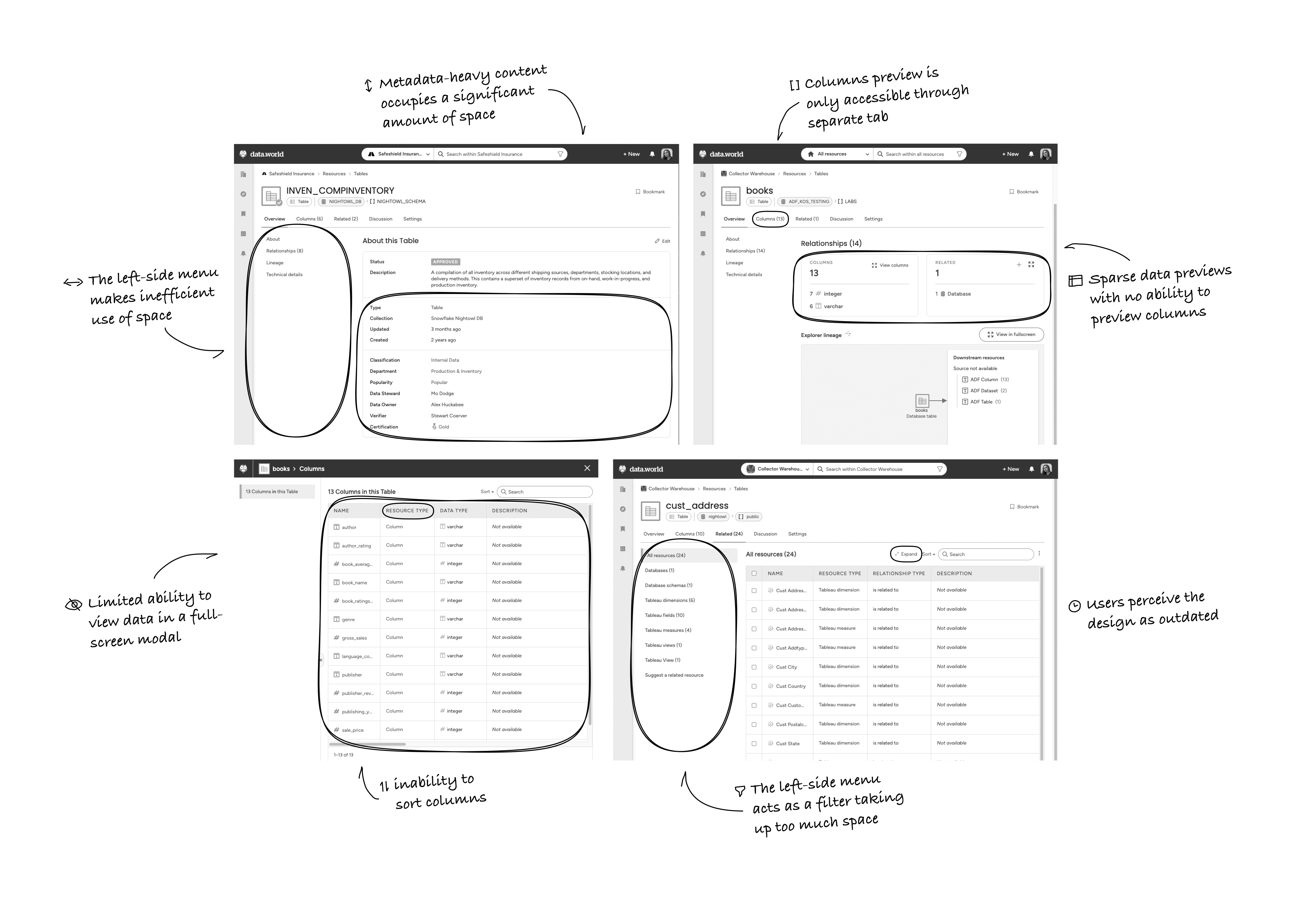
Nearly 24% of customers were churning after their first contract, costing $500K+ in annual revenue per lost enterprise. The biggest culprit? Outdated resource pages, which should have been the go-to portal for data discovery but instead led to confusion and distrust.
Opportunity
Tackle a major revenue drain by reinventing the user experience.
Introduce trust indicators that empower users to confidently identify and rely on the most dependable data resources.
Elevate the product’s interface design to reflect its mission as the leading user-focused data catalog platform.
Problem landscape
User struggles
Tedious data discovery: people sifted through multiple tabs and dozens of fields just to find what they needed.
No trust: from the start, I noticed this fundamental issue. The resource pages weren’t just cluttered — they were eroding trust. Users couldn’t easily tell which data resources were reliable, often forcing them to seek help from other teams.
Time-consuming workflows: analyzing a single resource, which should take just 2 minutes, often stretched to 15 minutes or more.
“I depend on these tables for analysis, but I can’t even preview them. Half the time I have no clue which one is reliable. I’d rather move my data to Atlan to get the clarity I need.”
— Senior data analyst, McKinsey
High-level approach
My role
I led a full-scale product redesign, putting user trust at the forefront. To get there, I:
Immersed myself: dogfooded the product daily, mapping every confusion point and friction.
Coordinated stakeholders: united engineering, product management, and customer success around a single goal: making the product so intuitive that analysts could locate reliable data in under two minutes.
Refined through data & testing: used heatmaps, usage logs, and A/B tests to guide each design decision. Embedded “data quality” indicators, reorganized content into fewer, more intuitive sections, and redefined the entire UI for clarity.
Before/After Resource Page** showing clutter vs. clarity
- **Data Quality Badge** mockups
Design process
Reference a “Double Diamond”
Research and definition
I started by dogfooding the product myself — spending hours navigating the same resource pages, simulating the real-world analysis tasks our users performed. This helped me empathize with the friction points and laid the groundwork for a user-centric approach. I then analyzed heatmaps, usage logs, and recorded user sessions to pinpoint exactly where frustrations peaked, and found that sprawling sections, hidden metadata, and inconsistency were pushing people away.
Heatmaps
Collaborative ideation
Armed with these insights, I organized workshops that brought engineers, PMs, and customer success leads into the same room. We hashed out a plan to elevate trust as the guiding principle of the redesign. Instead of overloading users with every possible field or tag, we agreed to prioritize the information that mattered most.
Miro
Rapid prototyping
I introduced an immediately visible data quality status — simple yet powerful — highlighting a resource's reliability based on validation rules checks, stewardship, accuracy, completeness, freshness, missing data and more. I restructured resource pages into core sections, eliminating redundant sections and focusing on scannable layouts that surfaced key data front and center.
Prototypes
Usability testing
When I tested these prototypes with power users, the feedback was immediate: they appreciated the new data quality indicators and loved the drastically simplified layout.
“Everything is right there — clean, and fast. I can't wait to use it.”
That early validation pushed us to refine minor details, like how to provide users with more customization or present multi-column previews without overwhelming them.
A/B experiment
Despite momentum, we faced an obstacle: data.world’s back-end system was monolithic, making quick pivoting and feature toggles cumbersome. So we launched a simplified MVP as A/B dry test to a smaller user base. Over several weeks, we measured adoption rates and direct feedback. Every bit of data we gathered confirmed that this redesign was working. Time-to-analysis among our test group improved by 73%, from fifteen minutes to four.
A/B prototype?
MVP to 100%
Metrics significant improvement provided the engineering leadership with the confidence to invest more time in refactoring the codebase. So despite back-end constraints, we optimized performance enough for an efficient user experience.
Tangible outcomes
The team celebrated as the results exceeded even our initial expectations!
Churn rates dropped by 14%, effectively saving around $6M in annual revenue.
Four new enterprise clients — attracted by the new user experience — signed up, adding $2M more to data.world’s bottom line.
Efficiency redefined: users now analyze data resources in just 2 minutes, a dramatic improvement from the previous 15-minute workflow.
Internally, the redesign also sparked a shift in how product and engineering collaborated. We established a more agile, user-focused development cycle that embedded frequent testing of designs into every sprint.
Some celebration??
Key lessons & looking ahead
Challenges and resolutions
As the Sr. product designer overseeing this revamp, I guided every aspect — from research and vision to prototyping and final implementation. Along the way, I had to balance technical constraints, evolving stakeholder expectations, and urgent business targets. Frequent alignment sessions ensured the team never lost sight of our primary objectives: reduce churn, elevate trust, and modernize the platform. The biggest lesson was that even with legacy systems and entrenched habits, a persistent, user-centered focus can make a monumental impact.
Future plans
Advanced data quality metrics: expand the reliability score by factoring in external lineage and usage frequency.
Continuous research: keep the feedback loop open with both enterprise and mid-market clients to refine and extend the platform’s capabilities.
Design system evolution: formalize new components for consistent application across all data.world products.
Final reflection
This project taught me that design isn’t just about making things function better, it’s a strategic tool for driving business resilience and winning user loyalty. By zeroing in on trust signals, decluttering the UI, and aligning the team behind a single vision, we turned a painful churn crisis into a powerful growth story.
See what’s next
Thank you for taking the time to explore my work! If you enjoyed this case study, there’s so much more to discover.


Let's connect 🔌
Let’s be friends! Whether you’re looking for a designer or just want to grab a coffee, my inbox is open.